
Ladies and Gentlemen – Extreme Makeover – The Corporate Edition!
Welcome to 2015! This is going to be a year of change.
As of 2015, Lichi is changing its image. After a year of intensive work, I am delighted, and proud, to present Lichi Translations’ new look, with a new logo, new website – an Extreme Makeover!
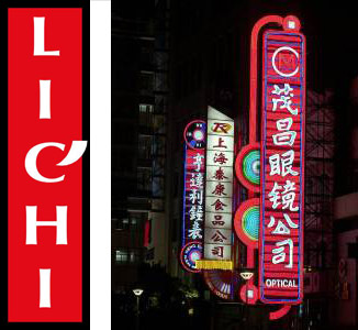
Let’s take a trip back in time to the year 2005. I decided that my business deserved a name, not just “Mikhal Heffer”. The Asian ring of “Lichi” appealed to me, since at the time, we were working mainly with the Asian market in Chinese and Japanese.
When my husband Ronnie, who is a graphic designer and an advertising professional, began to work on the new logo, the look we chose, naturally enough, was Asian, with a design derived from the vertical Chinese script familiar to everyone.
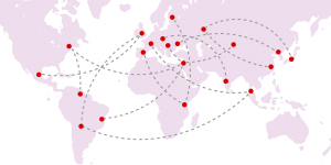
Now let’s fast-forward a few years: Lichi’s activities have expanded beyond recognition, and more and more new languages are featured on our agenda. Suddenly, we’re no longer a small company that focuses on Asia alone but a sizeable company with a wide international customer base. Our image needed to reflect this in some way.
The time had come to make some changes. Re-branding, it’s called.
As anyone who knows anything about branding knows, it’s not just about a nice logo and business cards. Branding has to mirror the company’s vision and its values.
And so the wise men of Lichi sat for seven days and seven nights to weigh all the possibilities and came to the conclusion that what we at Lichi actually do is make connections. We connect different languages, cultures, people and businesses. By making these connections, we help our clients do business in unfamiliar places and in languages they don’t speak.
This vision gave rise to Lichi Translations’ new logo, designed once again by my husband Ronnie (well, he was the cheapest on the market), which portrays the connection between the two points.
![]()
Throughout the entire branding process, we committed to keep the design simple, clean and, perhaps, even minimalistic. We wanted to create an atmosphere that is friendly, informal and pleasant. The main graphic element consists of red dots joined by a line. This also appears on the world map which we have used to emphasize the international nature of the company.

This is the approach we also used on our new website – www.lichitranslations.com
The process wasn’t easy: characterization, graphic design, content writing, translation and, finally, the actual programming, carried out by two companies, one in India, and the other in Israel.
Lichi Translations is striving to expand its international operations; and one of the reasons that drove us to make these changes was the need for a high-quality, professionally designed website in English which would reflect the full extent of our international capabilities.
The English site has been given a separate address (.com) and is aimed directly at the international community, which is already an important part of our customer base. Standing on the threshold of 2015, I feel very proud and very pleased with our completely new look.
I feel just as excited as those families who see their new homes minutes after the audience shouts “Move That Bus…. Move That Bus”.
Please do share your opinion with me on Facebook; I would love to hear from you.
Until then, I wish you a year of renewal.
Mikhal Heffer
Founder & CEO
Lichi Translations
www.lichitranslations.com
972-52-3516070
lichi@lichi.co.il
פוסט זה זמין גם ב: Hebrew


Leave a Reply
Want to join the discussion?Feel free to contribute!